
1. Vintage Vogue
Brides still gravitate to this classy, comforting style; often achieved with a dated pattern or material texture. Damask patterns and the fleur-de-lis are used to create Victorian glamour or Parisian prestige. Vintage never gets old.
2. Go Green
Eco-friendly invites are as hot as global warming. Some stationers have even opted to use this as their ‘thing’ to attract the chic hippie client. Recycled paper and wood veneer are replacing pearly papers. Invitations are no longer layered with see-through paper or with extra inserts with the necessary information. This ‘extra info’ is often placed in an e-mailer or even a website. The idea of the ‘wed-site’ is sometimes used as a replacement for an in-your-hand invitation; encouraged for saving the planet and to cut costs on printing and paper.
3. Informal wording
“We’re getting hitched” or “John asked Mary and she said Yes”- colloquial phrases are used in wedding stationery to set a more fun and relaxed tone. Many modern couples are paying for or contributing to the wedding so the necessity for the invitation to start with the parent’s names is no longer a must. The traditional “You are cordially invited” is cordially a thing of the past.
4. Fauna & Flora
Nature inspired stationery is almost always elegant and charming. Proteas, hummingbirds, wild rose bushes and trees are used to cover a large ‘wallpaper’ area or used as singular elements. Proteas in particular are a hit in our home country, also translated into the décor and bride’s bouquet. It’ll be interesting to watch how this style develops in South Africa… I see some Nguni cattle and antelope walking onto these cards!
5. Brave colour schemes
Duck egg blue and post box red, black and yellow, mint and pastel pink. Fortunately these seemingly outrageous colour schemes are generally executed by trained and talented designers who ‘ease’ the shock with calming graphics or minimal embellishments.
6. Travel
Stamped postcards, miniature airplanes, red and blue postage pinstripes – graphic elements from travel tickets and ‘sent-from-afar’ postcards are used to tell the story of a couple who come from different countries, have travelled a lot or have succeeded in a long-distance relationship. This theme is often carried through into the on-the-day stationery and décor with vintage suitcases and ‘numbering’ of tables named with different places the couple have visited.
7. Texas small town poster
This may be something only the more avant-garde stationers have delved into but it’s quickly catching on as a cool style for stationery. Chunky, serif, drop-shadow fonts, you know, like the one used for Boswell’s Circus? A large point font such as this coupled with a sans-serif as well as a script font – this is the basis for that ‘ripped off the shutter doors of an American ranch bar’ look. Graphic elements such as the pointing hand and a rolled-out banner add some visual eye-candy and bang-bang! your old-school cowboy look is achieved.
8. Different fonts in different sizes
Another trend only recently picking up is when a few fonts in different sizes are used to form a boxed-in paragraph. The text is justified to contain the wording in a modern, clean-cut form. Words in a sentence will often be made a fuss of by enlarging them or even creating a visual element from them. The ampersand (&) in the middle of a sentence, for instance can be enlarged to form a graphic key. If done correctly, an absolute winner. With large gaps and too many fonts and sizes, an ineffective mess.
9. Divine Twine
Organza, velvet or even satin ribbon? So last year. Natural is the new, with cotton twines and grassy string tied around the envelope you’re far more likely to impress. So great when a trend is also cost-effective!
10. Laser cutting
Laser cutting, rather than die-cutting is the cutting of a specific shape, into or out of an alternate material. Think perspex, thin woods, foam and thick cardboards. This is sure to impress any guest. Unfortunately it’s a pricey practice so many brides opt for only a small section or pattern to be cut.
For more info, please contact terry@ribbondesign.co.za
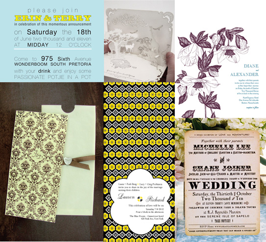
Photo Credits:
{ribbondesign.co.za} {theprettyblog.co.za} {looklovesend.com} {greengrassdesign.co.za}